")
")
Melbourne spotlight - how to tell when the market will turn
Melbourne house prices are falling in response to the COVID-19 crisis. Nobody knows with certainty how steep the falls will be, or how long the downturn will last, but the below analysis can help you pick the point at which broad-based growth will return to the market.
Melbourne house prices are falling in response to the COVID-19 crisis.
Nobody knows with certainty how steep the falls will be, or how long the downturn will last, but the below analysis can help you pick the point at which broad-based growth will return to the market.
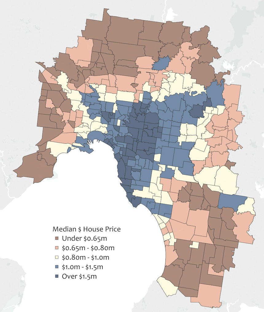
Melbourne is made up of over 400 suburbs. We segment them in a myriad of ways: by demographics, by proximity to CBD, by presence of top schools, hospitals, transport options; etcetera.
Melbourne’s most expensive suburbs are predominantly located in the Inner East and along the water, with more affordable suburbs found in the middle west and north. Prices remain relatively high along the main freeway lines to the northwest, west, northeast and southeast. Affordability increases the further from the CBD you go in all directions.
Since 2001, the market has experienced multiple inflationary and deflationary periods, each different in duration and degree. The below graph shows how prices have fluctuated in each price segment since 2001.
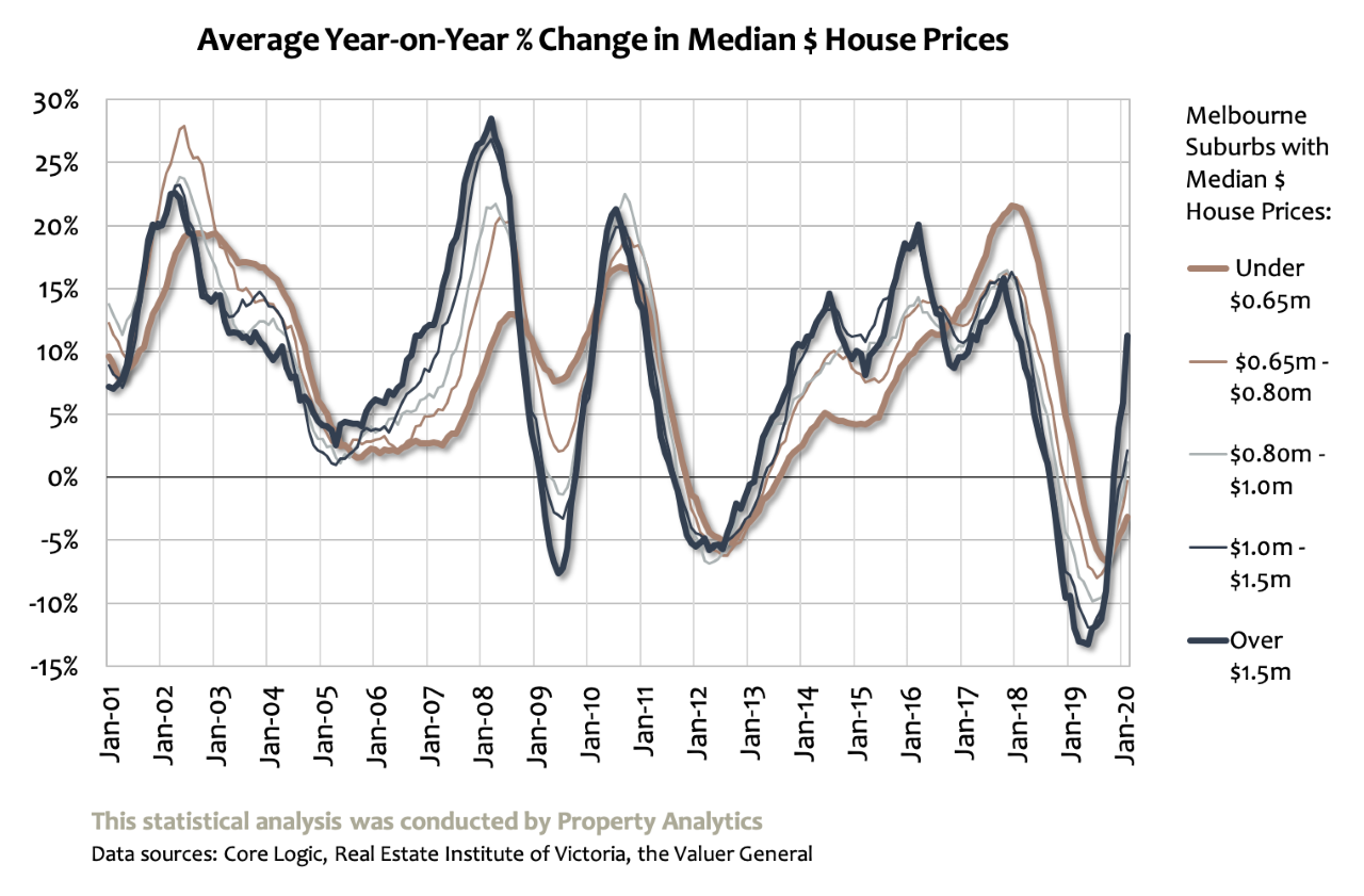
Comparing the average performance of the most expensive suburbs (Over $1.5 million in bold blue) to that of the most affordable suburbs (Under $650,000 in bold red) leads to some interesting findings.
When prices are rising, they tend to rise most (by $ terms and by % terms) in more expensive suburbs; but when prices are falling, it's these suburbs that are hardest hit.
More affordable areas tend to weather tough market periods better - prices hold up relatively well - but peak growth is usually lower in the good times.
As you’d expect, middle-priced suburbs tend to operate in the middle of the two extremes - their highs aren't as high as the most affluent areas, but their lows aren’t as low.
This graph goes a long way to answering the question posed above: When will we know that the market has bottomed out?
Price growth was moderating from 2002 to 2005, then shot up dramatically from 2006; the most expensive suburbs were the first to begin climbing.
Price trends fluctuated dramatically in the years before and after the GFC of 2007-2009, but when a stable growth pattern resumed, it was the top $ segment that rose first, again.
From 2018-2019, Melbourne housing suffered from the biggest market correction in living memory. Notice that it was the top segment that first achieved positive price growth.
Whether the market is turning upwards or downwards, suburbs with higher Median house prices usually turn first, whereas more affordable areas tend to lag behind the curve.
Smart investors know that timing is critically important to buying and selling well, and they’ll be looking to pick the bottom of the market. Monitoring activity in the most expensive suburbs is a good place to start, as prices tend to change their first.


")


